I’ve recently found myself daydreaming about home decor, especially as we enter the new year. With the winter months settling in, it seems like the perfect time to shake off the beige and grey that dominated our spaces for so long. Why not explore some vibrant hues instead? The walls are practically crying out for a splash of personality! Every January, design trends surface like a fresh coat of paint; they warm up our homes and restore our spirits. Let’s dive into what the top designers predict will rule in 2025.
Highlights
- Color-Drenching is making a comeback! 🎨 Imagine living in a room that’s a single, vivid color from top to bottom.
- Warm neutrals are overtaking the cold grays of the past. Think cozy and inviting! ☕
- Moody jewel tones like deep emerald and plush burgundy are here to add sophistication. 💎
- Expect unexpected pops of red to command attention in home decor. 🔴
- The Y2K aesthetic is back with its bright, nostalgic flair! ✨
Color-Drenching: A Bold Move
Color-drenching is not just a trend; it’s a full-bodied statement. Imagine walking into a room where the rolling waves of a vibrant hue wash over the walls, the ceiling, and even the furniture. It’s a sensory experience that can transform any dull corner into a dramatic locale! I remember my friend Sarah deciding to go all-in with an electric blue living room. From the floor to the ceiling, every inch screamed creativity. It was as if she created an ocean in her home, a place to escape and refresh.
This approach isn’t revolutionary, sure; it has been around for a while. However, it’s finally getting its moment in the spotlight. Color-drenching is great for balancing a room’s elements. You can calm busy textures or loud furniture by creating a monochromatic background. Plus, it gives the whole space a cohesive look that feels thoughtfully curated.
The Return of Warm Neutrals
After years of living with the sterile and cold “millennial grey” that pervaded our interiors, a wave of warm neutrals is rolling in. As we transitioned from the pandemic, many of us sought comfort and rhythm in our homes. Think layered beige tones, rustic textures, and earthy palettes. I outfitted my home office in soft taupe and light walnut, creating an inviting study nook perfect for those long Zoom calls.
Here are a few ways to integrate warm neutrals into your space:
- Combine different hues of beige for depth. 🤎
- Mix in natural textures like wicker or linen to bring the outdoors inside. 🌿
- Pair warm neutrals with vibrant accessories for a balanced approach. 🎈
Warm neutrals immediately create a cozy wrap-around—the antidote to those long, gloomy winter days.
Moody Jewel Tones: Gone Are the Days of Minimalism
Next up: moody jewel tones. These colors don’t merely whisper; they shout sophistication and character. Think rich plums, deep emeralds, and vibrant burgundies—perfect for those dark, wintery spaces where natural light is scarce.
When I think of jewel tones, I can’t help but remember my sister’s dining room makeover. She fell head over heels for a deep emerald feature wall, contrasting it with warm wooden accents. The sophistication made her dinner parties instantly noteworthy! If you’re considering this palette, consider leaning into the moodiness rather than fighting it. Instead of bright colors, embrace the darker shades that evoke intimacy and warmth.
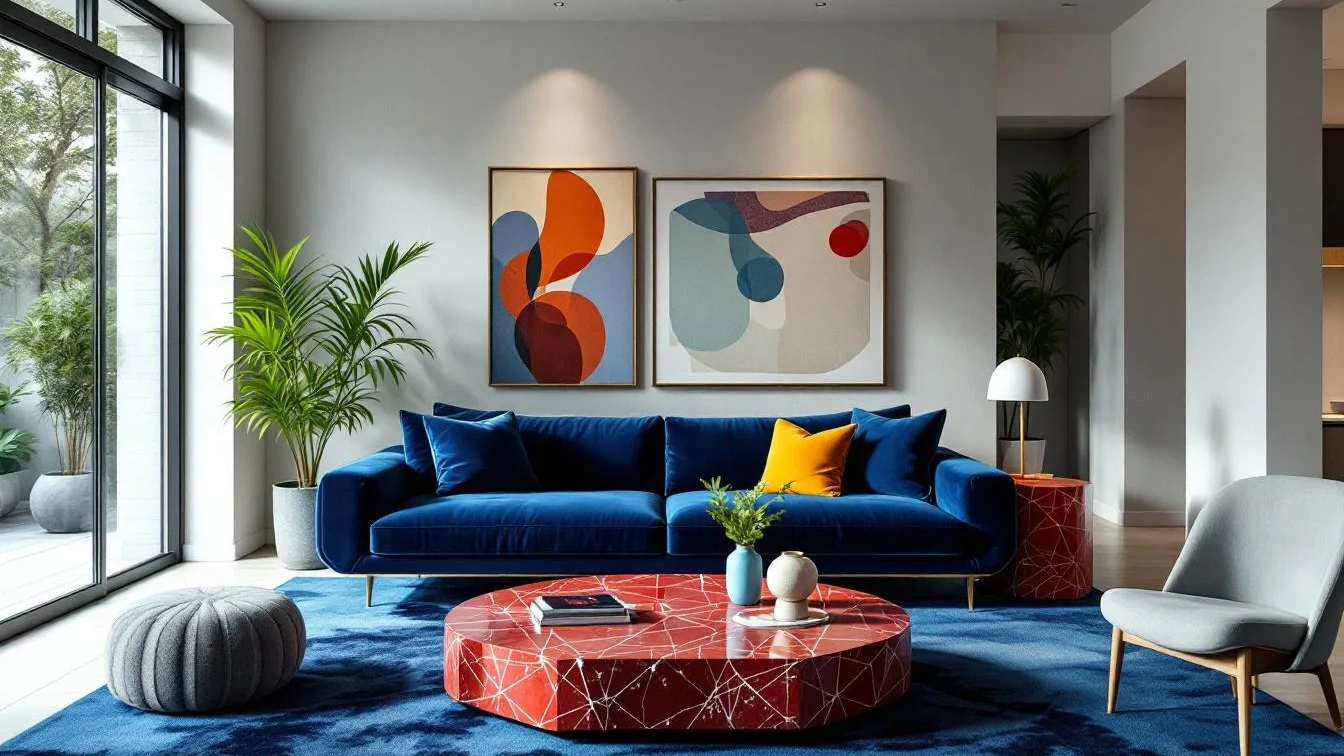
Unexpected Pops of Red
Adding just a dash of red can transform your space. This year, designers are encouraging homeowners to experiment with small accents of vibrant red—whether it’s a throw pillow or a bold piece of art. Red’s long wavelength draws the eye, making it perfect for creating a focal point.
Take a moment and imagine a serene beige living room. Now, throw in a crimson vase or daring red artwork. Suddenly, the room has personality and flair! It’s a delightful, easy way to jazz up your environment without needing a complete overhaul. Want to give it a shot? Here are some quick tips:
- Start small with decorative items: think cushions or art. 🛋️
- Layer red with softer hues to prevent overwhelm. 🌼
- Use red as an accent color in otherwise neutral rooms for a twist! 🔄
The Y2K Aesthetic: A Nostalgic Resurgence
Who knew that the early 2000s would swing back around? The Y2K aesthetic has made a fierce comeback, bringing with it all the nostalgia you can handle. Think retro-futuristic elements, iridescence, and cartoonish colors that remind you of your favorite childhood shows.
Perhaps you’re not a fan of the “Loud and Proud” vibe, but just a sprinkle of Y2K charm can reignite the spirit of fun in any room. The eclectic nature of this trend means you can mix and match without an ounce of guilt. I once adorned my workspace with a funky iridescent lamp that instantly makes me smile every time I see it. It’s a reminder that spaces should spark joy!
Transform Your Space Today!
The world of interior design is on the cusp of transformation, moving firmly beyond beige and grey. It’s time to make bold choices that reflect your personality and embrace the vibrancy of life. So why not take steps to infuse your environment with some of these exhilarating trends? Identify a room that could use a touch of revitalization, consider a color scheme that speaks to you, and don’t hesitate to go all out.
Whether it’s a soft hue that whispers comfort or a bold color that screams sophistication,” your living space could be the canvas for your self-expression. Remember, we’re not just decorating; we’re creating experiences. 💖